Project Summary
In 2019, ASIA Families celebrated its 10 year anniversary and embarked on a strategic planning road map which expanded the vision for the next ten years. To support these efforts, I volunteered on the website refresh project.
Timeline: 9 months (June 2019 - March 2020)
My responsibilities: competitive and comparative analysis, wireframing, information architecture, and website design and content migration
Team: As a volunteer designer, I collaborated with one of the Board Members who is responsible for Communications and the Executive Director.
Team: As a volunteer designer, I collaborated with one of the Board Members who is responsible for Communications and the Executive Director.
Knowing My 'Why'
I volunteer with ASIA Families because I believe in its welcoming mission of supporting the journeys of Korean adoptees and their families while growing a community through mutual support, education and Korean culture. I'm constantly discovering and exploring my Korean heritage and history, and am dedicated using my skills towards initiatives that promote understanding the complexities and nuances of Korean-American identity.
Challenge
As a growing organization, ASIA Families was in need of a website refresh to represent its newly expanded vision and strategy. The last major update to the website was in late 2015.
Solution
A website refresh strategy and plan that builds on existing content and site navigation while adding new landing page and secondary navigation.
Users & Audience
ASIA Families is a welcoming community that provides programs for Korean adoptees and their families and the Korean-American community. Visitors to the ASIA Families website range from parents, teen and adult adoptees, volunteers, and sponsors. The website is one of the key communication channels for program updates, special announcements and inspiring stories.
ProcessOver a 9-month period, I worked on this project as a volunteer designer. I used user-centered methods to support ASIA Families with its website refresh efforts. The double diamond design process represents the project phases:
Phase 1: Discover
Before diving into design, I leveraged existing materials including the new strategic plan and survey results from 90+ respondents in the ASIA Families community. This review helped me understand the expanded vision of the organization and put into perspective how a website refresh could support ASIA Families moving forward.
The 2018 survey conducted by the Board revealed how passionate, dedicated and appreciative the community is towards the programs and services that ASIA Families offers. For example, when asked "What is the most important aspect of ASIA Families for you?" these responses signify the appreciation of the community:
"There is not just one. It is the support our family has received over the years; the families we have met; the celebration of Korean Culture..."
"The most important aspect is the community that it provides for adoptees and their families and the love and support that everyone has for each other. It's truly uplifting and positive."
The survey also revealed common words that respondents associate with ASIA Families, which was helpful to integrate these themes in the design vision:
community • culture • family • support • welcoming • fun
I also conducted a comparative and competitive analysis of website navigational structures of organizations that are similar to ASIA Families. This exercise revealed a few gaps in the existing site map:
Phase 2: Define
The project scope was purposefully narrow. Our three objectives aligned with these usability heuristics:
1. Recognition rather than recall: maintain existing information architecture and site navigation to minimize user’s memory load
2. Aesthetic and minimalist design: update and modernize the main landing page
3. Consistency and standards: introduce additional elements and pages that enhance the user experience and ability to locate key information on ‘About’ and ‘Contact’ pages
I proposed a revised site map that addressed the gaps I identified in the prior phase.
Phase 3: Develop
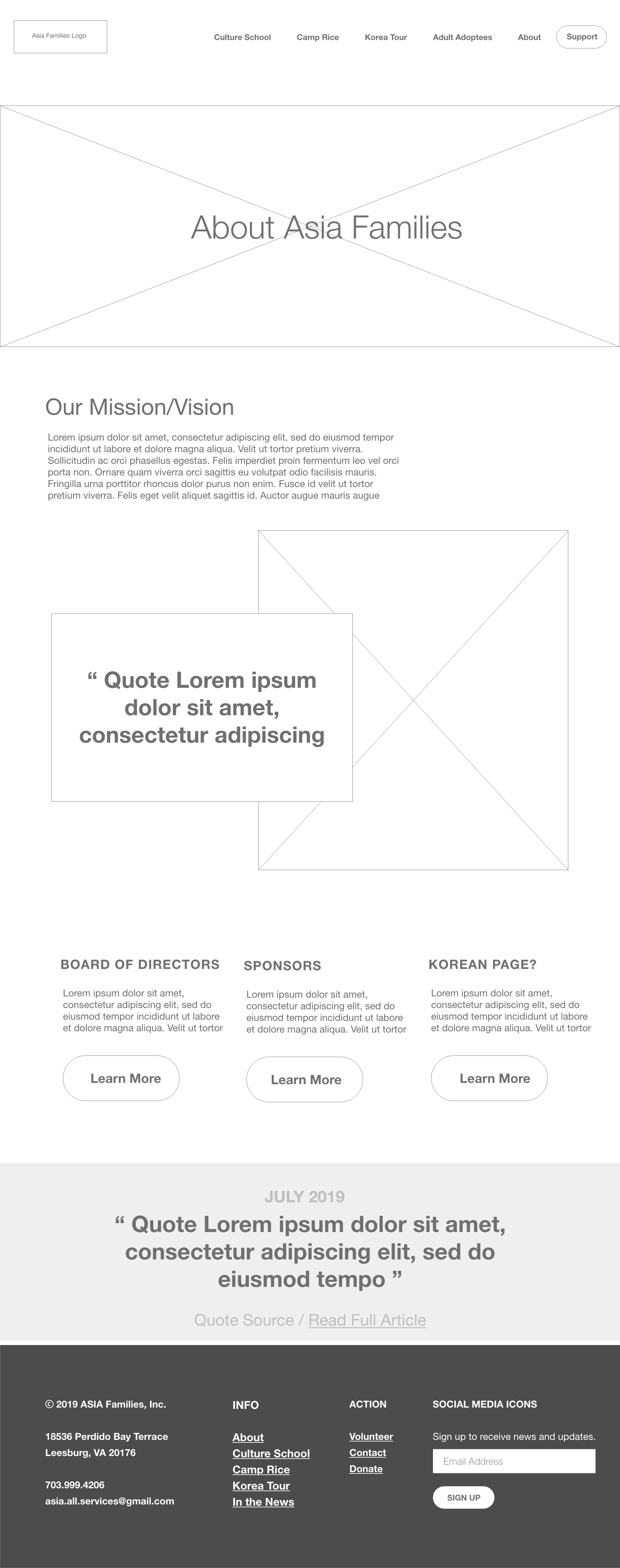
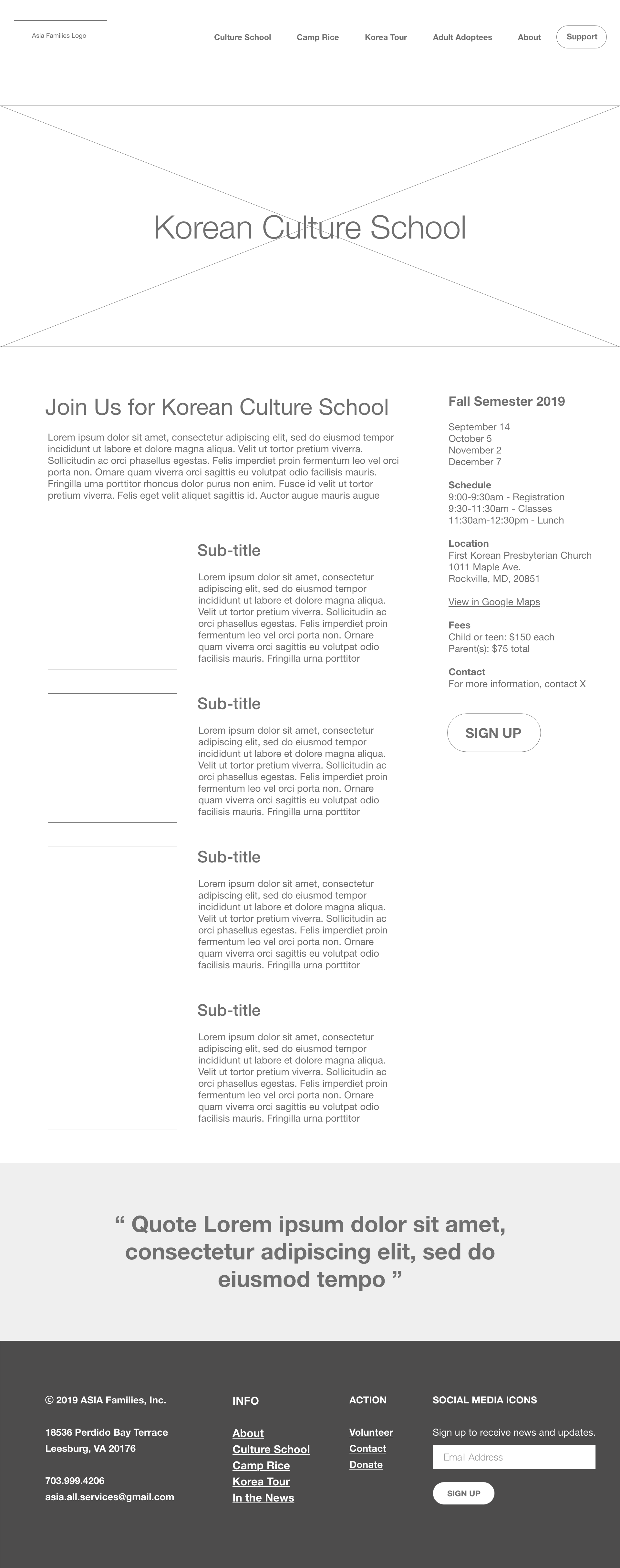
Using the updated site map, I created wireframes to visualize the new layout of the landing page and the about page. I divided the site map into smaller scopes of work in Trello to reduce feeling overwhelmed with the project workload.
I used the mid-fidelity wireframe as a guide to migrate content, create new pages, and design a new landing page. All of the updates and design work were completed in Squarespace’s ‘preview mode, I could view the updates in the new template, without affecting the live site.


Phase 4: Deliver
After migrating all of the content, selecting new visual assets and finalizing the front-end design, a preview of the refreshed website was shared with the team and the Board of Directors.
The website went live in March 2020, coinciding with multiple time-sensitive announcements related to program cancellations due to the COVID-19 crisis.
Outcomes & Lessons Learned
The project outcome was a modernized and refreshed website that (1) maintains information architecture that repeat visitors/users are familiar with; (2) enhances the landing page with minimalist design and visuals that portray the fun and community-oriented programs that ASIA Families offers; and (3) introduces new 'About' and 'Contact' pages for easier access to key information and a streamlined contact form.
As a designer in a volunteer capacity, I learned that building trust, pitching ideas, and taking initiative, are useful skills to bring value to a design project that is under-resourced but has potential for high impact. I grew in my capacity to get creative with leveraging existing research, and finding the balance of 'just enough research' given constraints such as time, access to research subjects and resources.
Next Steps
I continue to volunteer with ASIA Families in a design and communications capacity. A few upcoming projects include iterating the website and more broadly streamlining the brand and visual assets:
1. Conduct further tests and improvements on the website: I ran a rapid tree test to study the behaviors of finding the About, Contact and Volunteer pages. Although it was a small sample (6 people), 67% ended up at the correct answer, revealing opportunities for future improvements.
2. Facilitate and lead a logo refresh project: the Executive Director and Board approved this project for 2021.
3. Implement a brand style guide: to promote and achieve consistency across communication channels including the website, newsletter, and and future marketing collateral and visual assets.
Client Feedback
"The new site has contributed to increasing the number of new community members. This year we have been receiving more client inquiries than any other years before. We [also] experienced an increased number of donations came through our new website. Our donors feel convinced that every dollar they donate goes to support the community as they can see the program updates, pictures and news on the website. I strongly feel that the new site is a perfect tool to engage donors and philanthropists to support the organization."
- Grace Song, Executive Director

